Standard black vs rich black
The black in black-and-white printing varies markedly from the black in full colour CMYK printing, often referred to as rich black printing.
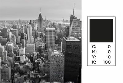
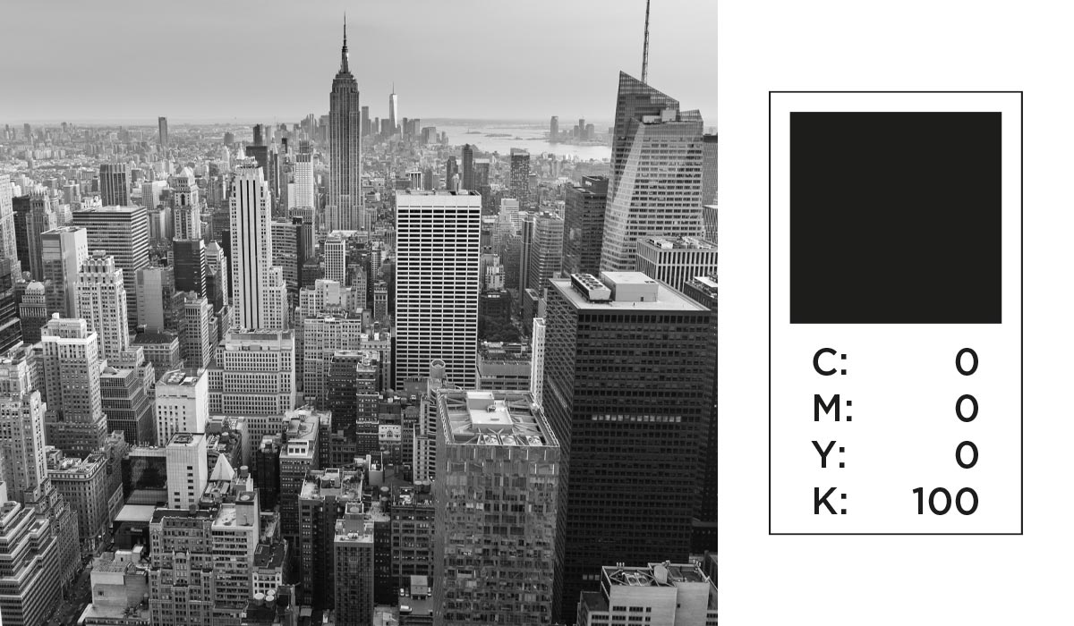
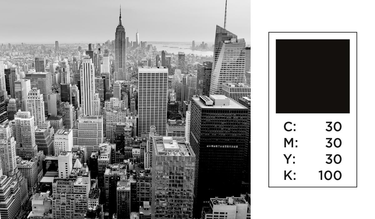
Standard black (K) vs. rich black (CMYK) values
Black is one of the most commonly used colours in printing. However, it might surprise you to learn that not all black inks are identical. Whether it's in black and white or full colour CMYK printing, the type of black ink used can vary significantly. There are two main types of black used in printing: standard black and rich black.
Standard black is purely black ink (100% K) on its own, whereas rich black includes additional Cyan, Magenta, and Yellow. This mixture achieves a deeper and more vibrant tone.
While both shades may look similar on a computer screen, they will not appear the same on paper. To maintain consistency, it's important to verify the colour values carefully. A closer look at the provided illustration will show how the two different blacks will appear once printed.
When not to use rich black
Even with a full colour CMYK project, it's best to steer clear of rich black for small text, line art, or any design with very fine lines. Why? Tiny misalignments in registration can cause a blurring effect around the edges. This issue is often noticeable in newspaper printing.
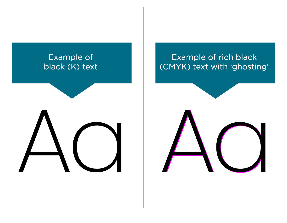
What does rich black text look like?
Here’s what it looks like: consider thin text and a black background set up with CMYK profiles (rich black) rather than greyscale (standard black). Rich black is created using four separate ink plates that layer ink over each other. If just one plate is slightly misaligned, it results in ghosting.
In the image shown, it's evident that magenta isn't lined up with the others. For fine lines like these, standard black is the better option as it uses only one ink plate, avoiding multiple layers.