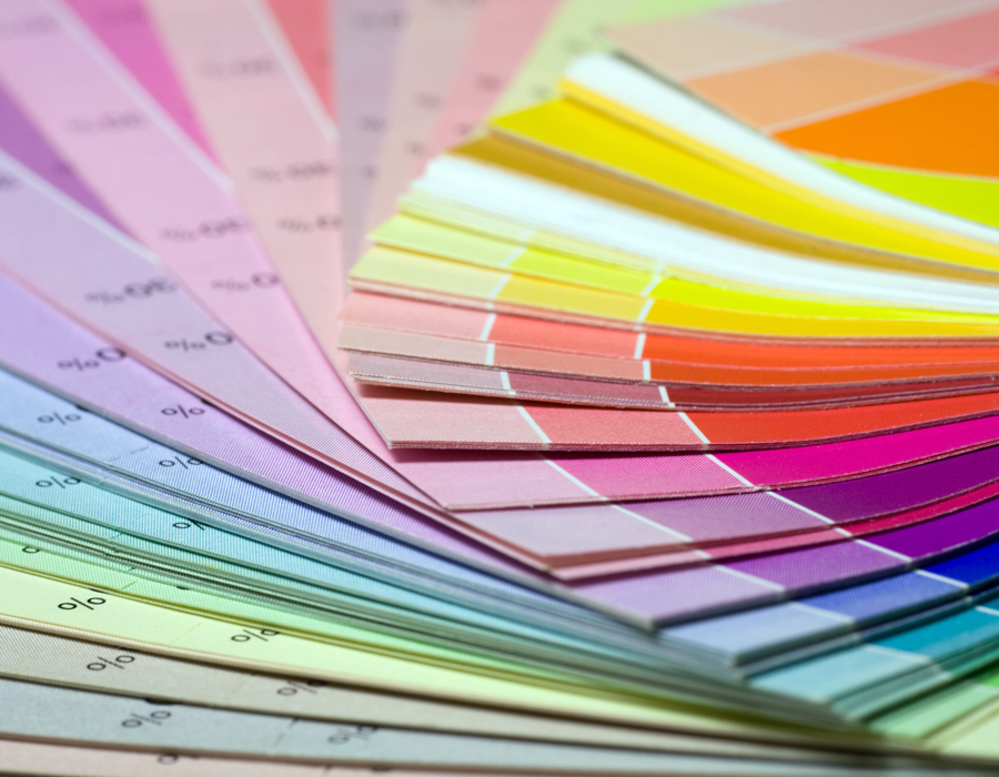
Colour guide for printing
When it comes to printing, getting the colours to behave exactly as you’d like can seem like an impossible challenge. Yet, by delving into the various facets of printed colour and grasping its numerous idiosyncrasies, you'll quickly learn how to nail it on every occasion.
However, by experimenting with different parts of printed colour and understanding its many peculiarities, you can improve your chances of getting it right every time.
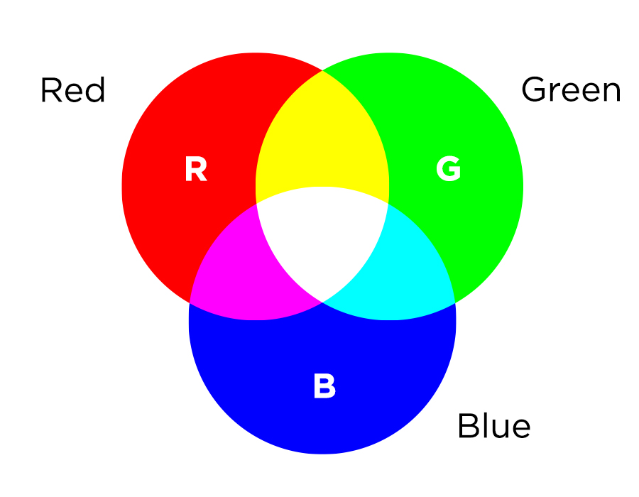
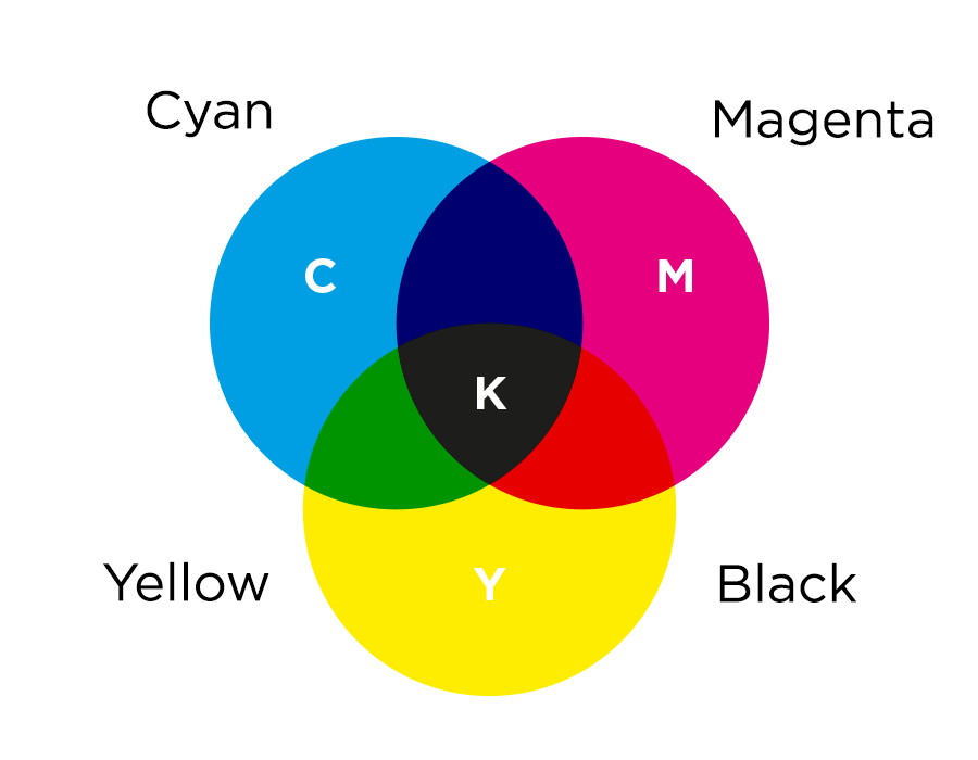
The difference between RGB and CMYK
Our platform does handle RGB colour files, automatically changing them into CMYK for print, though the colour shift might not be flawless every time.
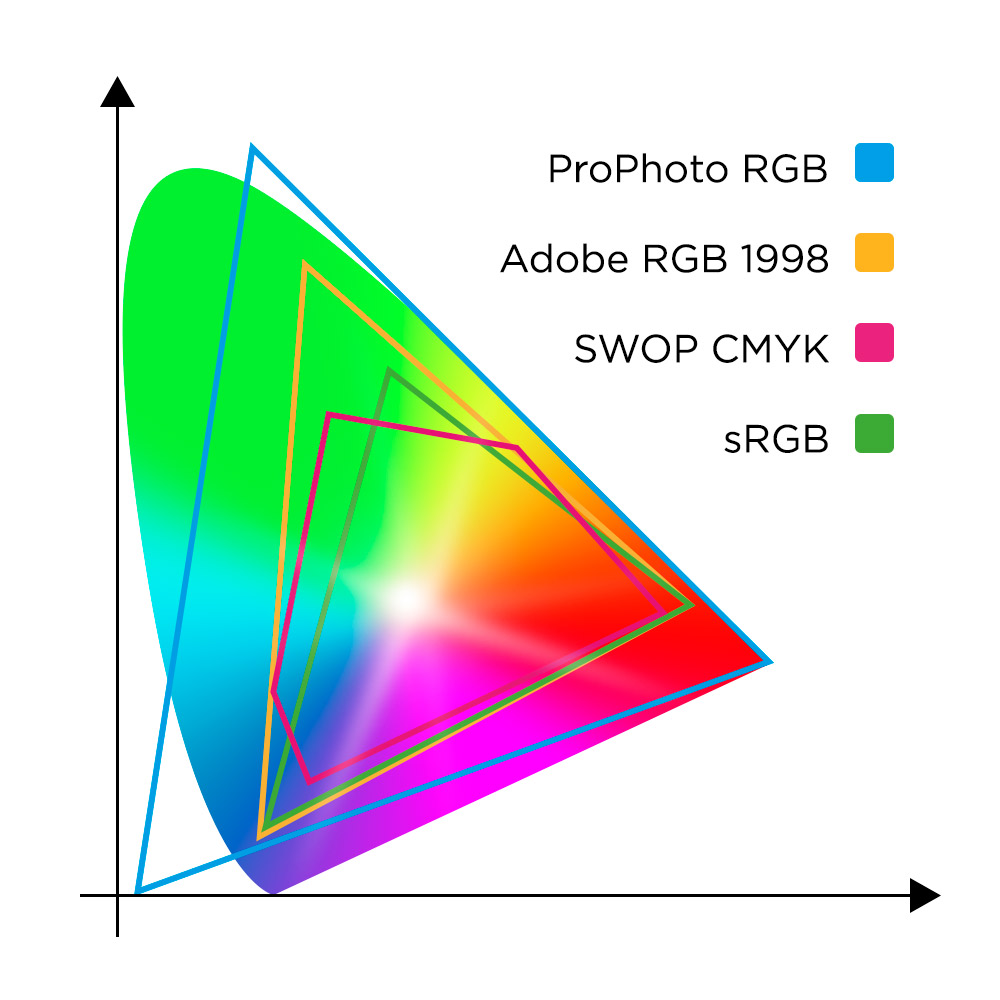
Devices like computer screens, televisions, smartphones, and LCD displays all operate on an RGB colour profile. This profile creates various colours through the combination of red, green, and blue light, without any ink involved. To print these RGB files accurately, they must be transformed into a CMYK format, which uses Cyan, Magenta, Yellow, and black(K) ink for a print-ready composition.
For a comprehensive understanding of the differences between RGB and CMYK colour models, we encourage you to check out our in-depth guide.
We have also put together a recommended list of CMYK values to make sure your prints come out with bright and vivid colours.
Converting RGB to CMYK
It is not possible to directly convert RGB to CMYK. The transition from light to ink means some RGB colours just can't be replicated in CMYK. If a print service asserts they can print directly from RGB, that's a red flag!
However, this doesn't mean converting RGB to CMYK is out of the question. Our handy conversion guide makes the process straightforward and user-friendly. By converting your RGB files to CMYK yourself before sending over any artwork, you gain complete control over the print colours, even allowing for adjustments to those more challenging shades.
Standard Black vs Rich Black: What’s the Difference?
Litho printing offers two primary methods for creating black: standard black and rich black. Standard black sticks to using just one colour, black (the 'K' in CMYK), making it the go-to choice for simplicity. Rich black, however, uses a combination of Cyan, Magenta, Yellow, and Black, delivering a deeper and more vivid black.
Transitioning artwork from RGB or greyscale directly to CMYK? You'll achieve a rich black by default.
There are times when opting for standard black over rich black is better. This is crucial for artwork with delicate details, such as tiny text or the intricate lines seen in comic book speech bubbles. In projects where every colour including black is vital, sticking with standard black is wise to avoid 'ghosting'. Ghosting occurs when the slight misalignments of the four ink plates used for rich black create a faint, undesired shadow effect.
To find out more about standard black and rich black check out our comprehensive guide.
Standard vs rich black printing
You might also find our guide on full colour versus black and white printing handy. There are occasions when printing blacks in full colour is the best way to achieve truly deep blacks.
Colour matching
Colours can appear differently on your monitor than they do on printed material, mainly because screens emit light while printed items reflect colours. The type of paper and finish you choose will also influence how your colours look.
For best results, we suggest printing on silk paper, whereas uncoated paper tends to give colours a slightly muted appearance.
The CMYK printing process uses four ink colours (cyan, magenta, yellow, and black) and might result in very minor differences in colour between different print runs, and even slight variations within the same batch. If precise colour matching is vital for your project, our print specialists are here to offer the advice you need to achieve the perfect finish.
Learn more about colour variance
In litho printing, subtle colour shifts might not come through, particularly with very high ink saturation. This could cause your designs to appear darker than they do on your computer monitor.
If your overall ink saturation levels are too high, expect the print to look darker than anticipated. This is notably the case for deep blues and blacks, which may seem vibrant on a lit screen but turn out much darker on paper if saturation exceeds 300%.
For specific colour saturations, very light ink coverage below 10% might not print, and coverage above 90% could result in a solid colour.
Check out our ink coverage saturation guide. It offers tips on steering clear of extreme saturation levels, ensuring every detail in your print is visible and crisp.